
Colours that are Accessible
What is Colour Blindness?
According to researchers at the National Eye Institute, there are three forms of colour blindness:
Red-green colour blindness
This common form of colour blindness makes it hard to distinguish between red and green.
There are four types of red-green colour blindness:
- Deuteranomaly is the most common type of red-green colour blindness. It makes the green look more red. This type is mild and doesn’t usually get in the way of normal activities.
- Protanomaly makes red look more green and less bright. This type is mild and usually doesn’t get in the way of normal activities.
- Protanopia and deuteranopia both make you unable to tell the difference between red and green at all.

Blue-yellow colour blindness
This less-common form makes it hard for people affected to tell the difference between Blue and green, and between yellow and red.
There are two types of blue-yellow colour blindness:
- Tritanomaly makes it hard to tell the difference between blue and green, and yellow and red.
- Tritanopia makes you unable to tell the difference between blue and green, purple and red, and yellow and pink. It also makes the colours look less bright.
Complete colour blindness
This form of colour blindness is also known as monochromacy and is quite rare. Those affected are unable to see any colour. As well as this, depending on the type, it could make it hard for people to see clearly and may make them sensitive to light.

If I’m not colour blind, should I care?
Colour plays a significant role in our everyday lives, not just as part of an element that makes things aesthetically pleasing, but as a method for communication. We use colours to invoke emotions, warnings, or to make a statement. But when a person is unable to see these colours, the message is lost, and this hinders the impact. Careful use of colours is not just important for people who are affected by colour blindness, but by everyone.
Take these two ‘Danger’ warnings. Notice how the red sign draws your attention?
For many people not affected with colour blindness, we generally associate red as a warning sign, but for someone with red-green colour blindness, this is what they may see:

Either way, both the red and the green variation stands out more than the pastel blue variation, and that has to do with the Contrast Ratio.
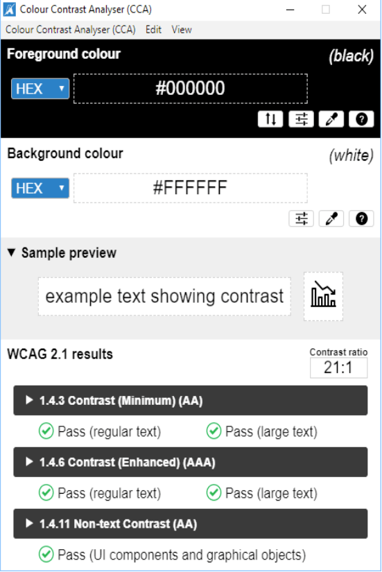
Contrast ratio is a measure of the difference in perceived “luminance” or brightness between two colours. This brightness difference is expressed as a ratio ranging from 1:1 (e.g. white text on a white background) to 21:1 (e.g., black text on a white background).
The Web Content Accessibility Guidelines (WCAG) developed by the World Wide Web Consortium (W3C), have detailed a standard for appropriate contrast ratio. This standard is to be used on digital screens to ensure readability for all users.
Three levels of accessibility in the WCAG regarding the use of colour
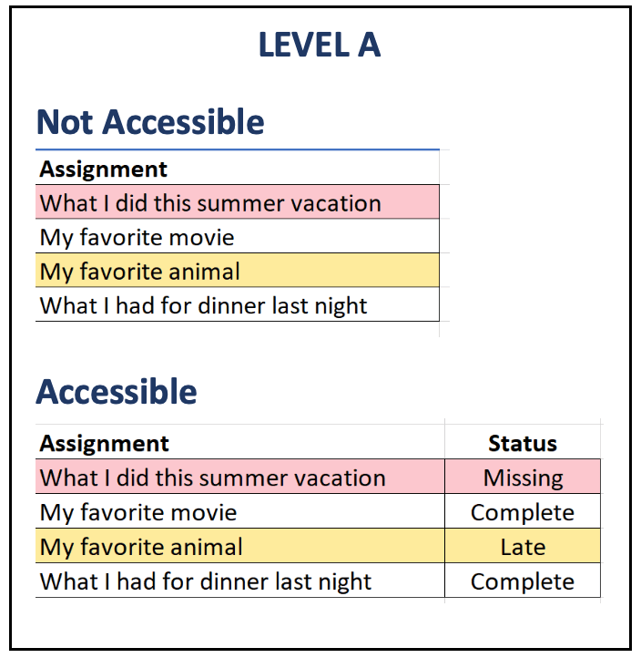
- Level A – Colour is not used as the only visual means of conveying information, indicating an action, prompting a response, or distinguishing a visual element.
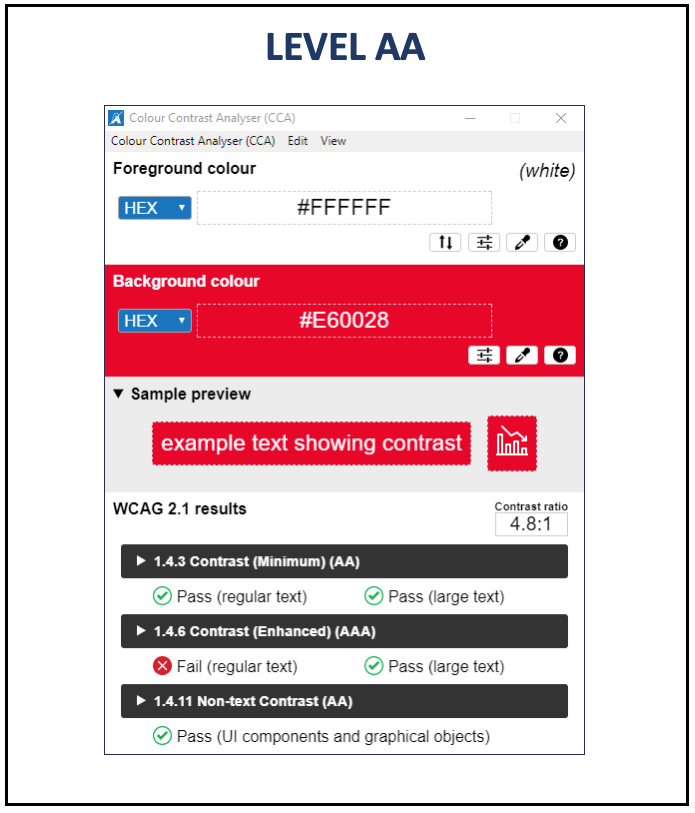
- Level AA – For the minimum requirement of this level, the visual presentation of text and images of text has a contrast ratio of at least 4.5:1, except for the following:
- Large Text: Large-scale text and images of large-scale text have a contrast ratio of at least 3:1;
- Incidental: Text or images of text that are part of an inactive user interface component, that are pure decoration, that are not visible to anyone, or that are part of a picture that contains significant other visual content, have no contrast requirement.
- Logotypes: Text that is part of a logo or brand name has no contrast requirement.
- Level AAA – For a more enhanced requirement, the visual presentation of text and images of text has a contrast ratio of at least 7:1, except for the following:
- Large Text: Large-scale text and images of large-scale text have a contrast ratio of at least 4.5:1;
- Incidental: Text or images of text that are part of an inactive user interface component, that are pure decoration, that are not visible to anyone, or that are part of a picture that contains significant other visual content, have no contrast requirement.
- Logotypes: Text that is part of a logo or brand name has no contrast requirement.
So for text with a low contrast ratio of 2.1 : 1 it is rather difficult to read for anyone compared to text that has a contrast ratio of 15.3 : 1

NOTE: In most instances, we always aim to achieve the highest level of accessibility possible. But there could be situations where that is not possible. In Australia, the requirement for achieving appropriately accessible content is compliance with the WCAG 2.0 standard to the Level AA.
click images to enlarge

How do I find the colour contrast ratio?
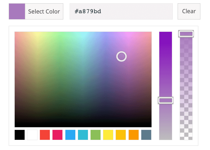
Eg. The HEX colour code for this purple is #a879bd
Before we start looking at the various tools available to determine the contrast ratio, we need to first understand what colour codes are.
Colour codes are numbers that define a specific colour, and the format will depend on the Colour model. For digital displays, we usually use the following Colour models:
- RGB – The most commonly used colour profile in the world of computers, TV screens and mobile devices is RGB. RGB is the process by which colours are rendered onscreen by using combinations of red, green and blue.
- HSL/HSV – HSL (hue, saturation, lightness) and HSV (hue, saturation, value) are alternative representations of the RGB colour model.
- HEX – Designers and developers use HEX colours in web design. A HEX colour is expressed as a six-digit combination of numbers and letters defined by its mix of red, green and blue (RGB). Basically, a HEX colour code is shorthand for its RGB values.
For most colour contrast analysers, you will need to know either the RGB, HSL or HEX colour code for your background and foreground colour to determine the colour contrast ratio.

click images to enlarge
If you would like to utilise an online colour contrast analyser, WebAIM Contract Checker is an easy to use tool that will help identify if the colour combination passes the WCAG standard for colour contrast ratio.
If you prefer to utilise a desktop application instead, Colour Contrast Analyser is a free tool similar to the WebAIM Contrast Checker with the added advantage of having an eye dropper tool. This tool allows you to select the colour without the need to know what the colour code is.
I’m confused, can you make it simpler?
Understandably, all of this can be quite confusing, and it can feel a little overwhelming if we need to constantly check every single text colour combination we use for our slides, documents, websites, handouts, etc. So, to help you out download this RMIT Colour Text Contrast reference guide to help you identify which RMIT colour combinations falls within WCAG Level AA and AAA standards.
In conclusion, when you design your documents with a good colour contrast ratio, you are not just designing content that is accessible to people with colour impairments, but you are making that content accessible and impactful to EVERYONE.

Web Accessibility is our legal obligation according to the Disability Discrimination Act 1992 and Disability Standards for Education 2005